Taking a Vermont Country Store Web Presence into the Future
REBUILDING A VERMONT GENERAL STORE LANDMARK (ON THE WEB)
The Warren Store is one of those places that you just have to go to and can’t forget when you leave. Part general store, part deli, part wine shop and craft beer mecca…the Warren Store is many things to many people. Locals crave the ‘Number Six’ sandwich (think Thanksgiving dinner on a homemade baguette).
 |
| Screenshot of old website. |
In the winter of 2014/15, the Warren Store worked with a down-New England design firm to retrofit their brand from a black and white line drawing to something a little more artistic. While working on the new brand, they asked us to give them an estimate on redesigning and building a website.
Cobwebs on the web
Their old website was beyond ‘dated.’ The design was meant for a fixed height and not only barely worked on a desktop, it forced massive pinch-zooming on smaller handheld devices.
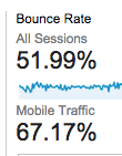
The 8+ years of analytics data showed that the average visitor spent only 1 minute per session on the site and that the overall bounce rate was a poor 51%.
 |
| High Bounce Rate on Mobile Traffic |
Worse, the mobile & tablet visitors were bouncing at a whopping 67% and spending even less time on the site. It was a lot of pinching and scrolling.
Building a Team that can succeed
The team was made up of
- Project manager Tim Volk, from Keller Samets Volk
- Branding: Kaiser Dicken
- Design/Builders: VickeryHill’s Jake, Spencer & Steve
- Copywriter: Shelly Robbie Communications
We spent many hours talking about how a new, responsive website could help them with their communications and revenue goals. We also discussed the importance of quality analytics and ongoing content management.
Shelly Robbie worked with the staff at the store staff and owners on developing that first-day launch content that would set the Warren Store up for past and new visitors in the days after launch.
We ended up with a comprehensive list of visitor goals and a new sitemap that includes:
- Deli Menu views/downloads
- Contact form completions
- Newsletter Signup
- Social sharing of content
- Event Calendar views
- Social referrals
- Site Search
- Telephone call (mobile)
Our other priorities were to move the outbound communication from one of story telling to a more modern technique of creating broadcast emails that would tease the reader to open, inform them of new content/happenings and drivethem to click on a link to web pertinent traffic. End goal: train them that the website was the place to go to find out the latest and greatest about the Warren Store, Warren Vermont and the Mad River Valley.
Design/Build
The six of us spent most of the winter/spring adjusting wireframes and reviewing design ideas until we came up with a clean ‘Warren-Store-y’ look-and-feel that respected the history of the general store but modernized the place with some fresh paint and modern techniques.
The site reads well on a large desktop screen, an iPad/tablet and even smaller smartphone devices. We consider the content in the context of the device interacting with it and make telephone numbers clickable on smartphones and physical addresses that open up your devices map application for easy directions.

It’s not a poster
The site just launched in June of 2015 and we can’t wait for the upcoming content sessions, analytics review and minor modifications.
We plan on meeting monthly to look at how the site performs, find areas that can be improved and re-work content so that it speaks to the visitor. Our goal is to give the visitor content that matters and every means possible to come visit the Warren Store in person many many times. While homemade deli items like ‘Butcher Beans’ do a good job of that for the repeat visitor – we want the first-time web visitor to want to make their first in-person visit to the Warren Store.